

Letter-headz
Making words fit into pictures

In between travel days I was able to make solid lettering progress on The World Is a Funny Page.
Lettering is one of the comics duties that many people disregard. Honestly, if you don’t make comics, I get it. Most people associate lettering with the same words that you would see in prose novel, aka, throw it in a Microsoft program and copy/paste. But there is so much more thought that goes into placing words in a comic, and truthfully, it can take a ton of time if it’s a complex page.
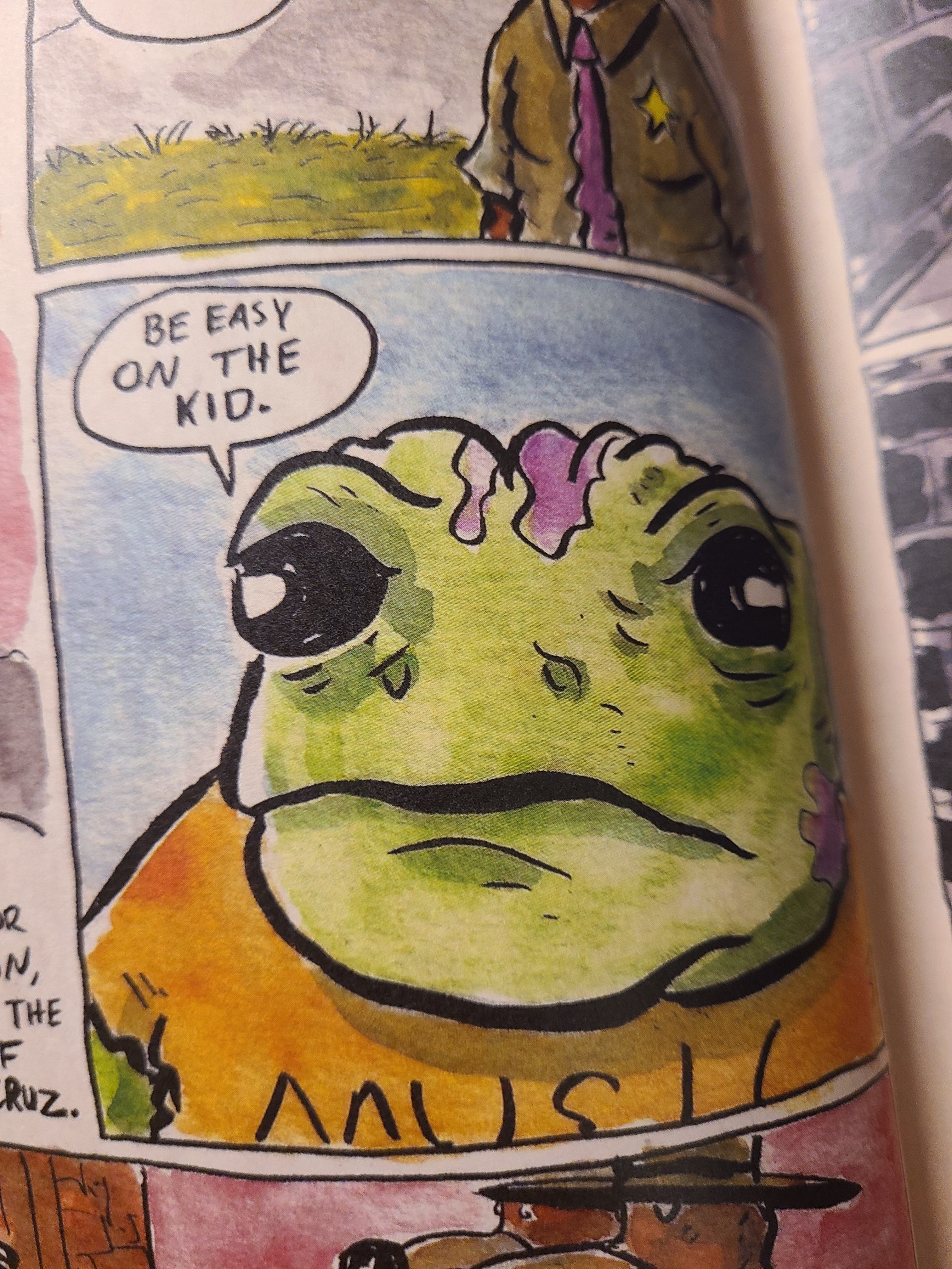
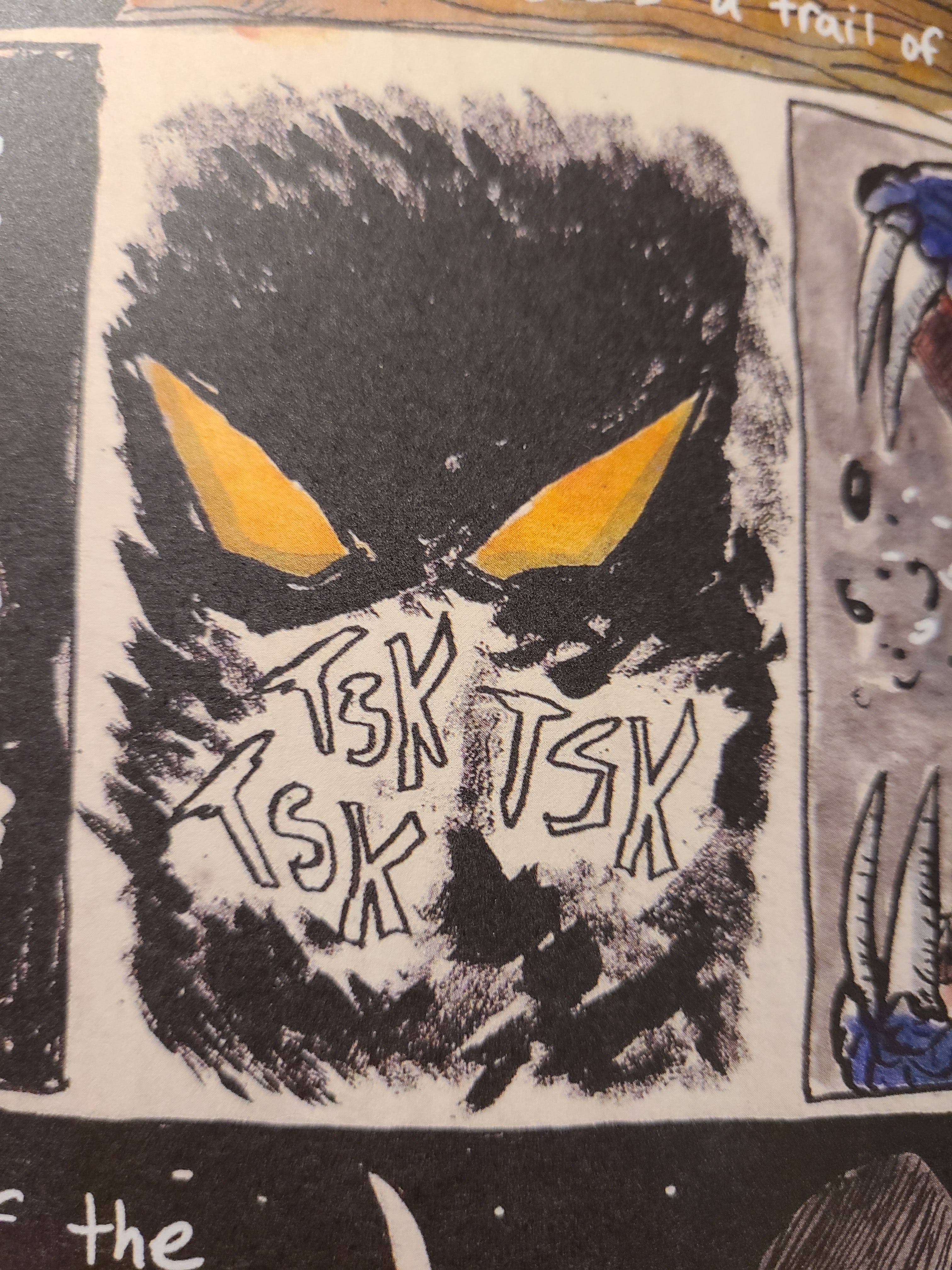
As I continued to evolve my comic making, I began to gather what “brand” of lettering that I enjoy reading. For those of you who read West, Not South, you can clearly see that I really like a hand-lettering look. To me, it gives words a real sense of energy, the same sort of energy that you find when actually speaking to someone in person. Everyone has an accent, phrases, inflections, and rhythms that make the sound of their voice unique. In West, Not South, there are many rugged and animated characters, so that liveliness in their speech really needed to show. I tried digital font lettering at the very beginning of the project, but it was just not working.
In Funny Page, I am using a mix of digital tools and hand lettering to capture what the story needs. Most of the captions are coming from Tom Graveless, who is a calculated ex-CIA operative, so I am using something like a “typewriter” font. In my head, I see Graveless telling his story in a field report, so I think this method is a good fit.
For speech bubbles and sound effects, I still really like the hand-written look. And as with all of my comics, I like experimenting, so expect to see things break away from the formula! I do a lot of instinctual things when I’m in the creative moment. It’s fun seeing what eventually happens on the page.
Cruel Universe
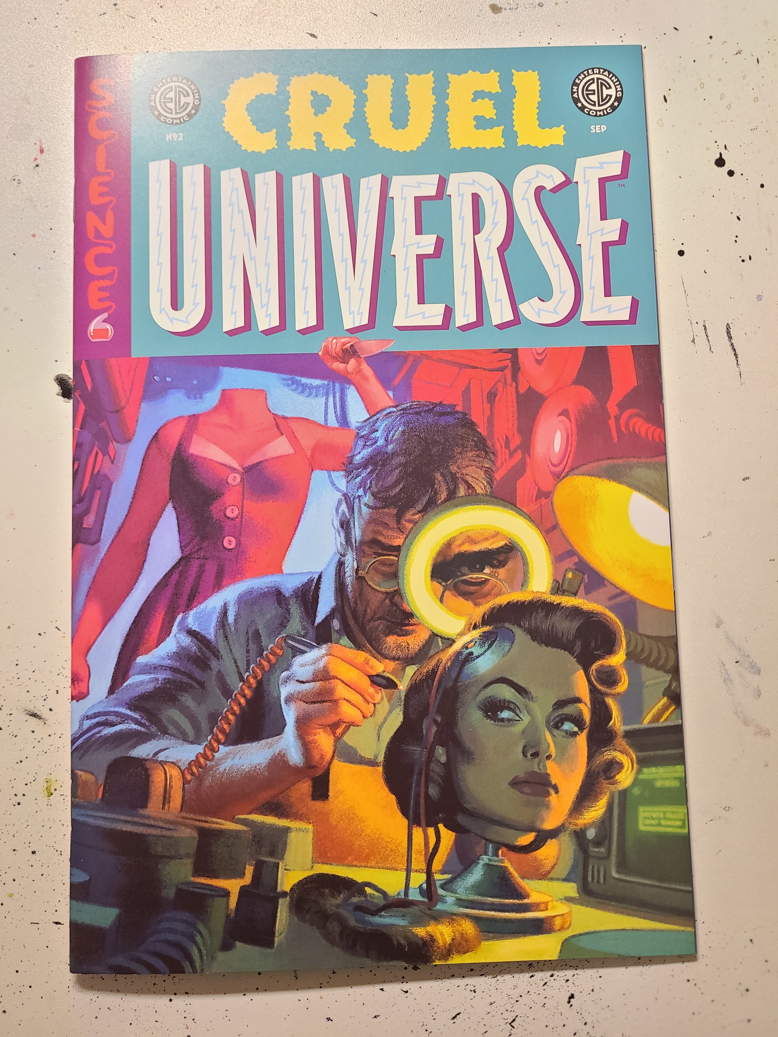
Oni Press recently acquired the “EC Comics” brand and has been releasing new science and horror anthology comics. While I have not read a ton, I love the old EC Comics aesthetic, and I think Oni nailed that classic tone in their renewal. I recently read Cruel Universe #2 and had a blast with it. Something just feels right about short science-horror stories in the comic form. My favorite story in this issue was called “Ray Gun” by Christopher Cantwell and David Lapham.
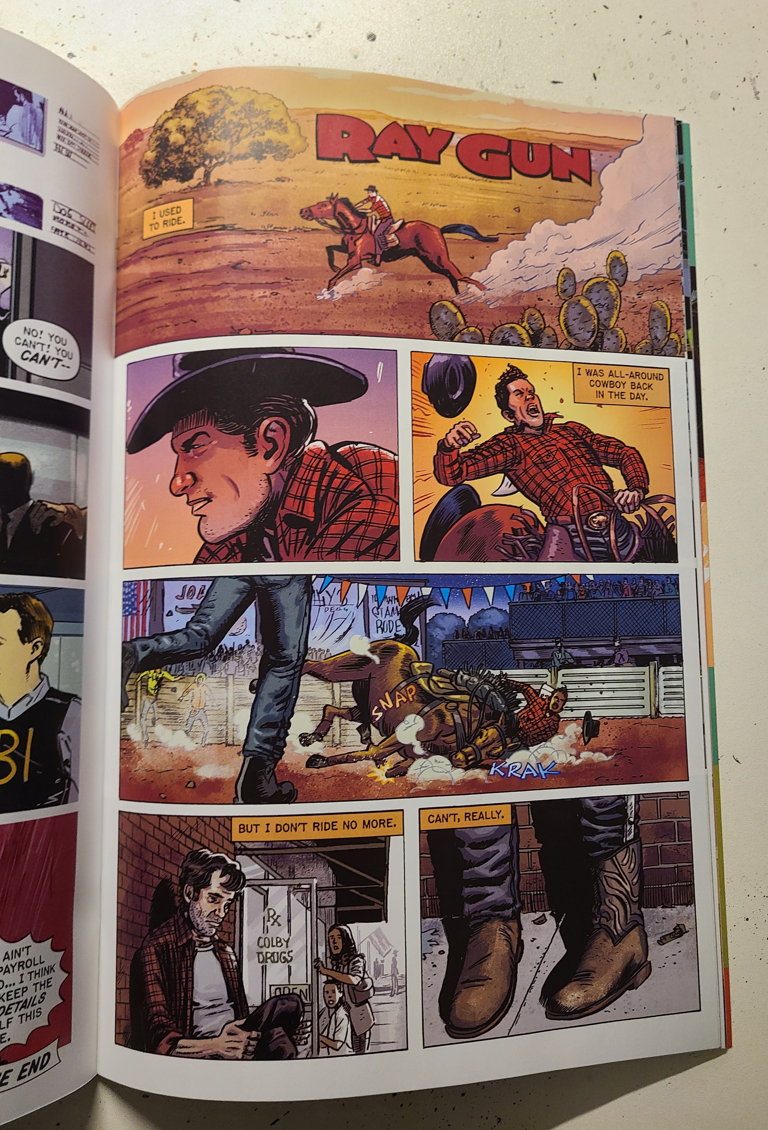
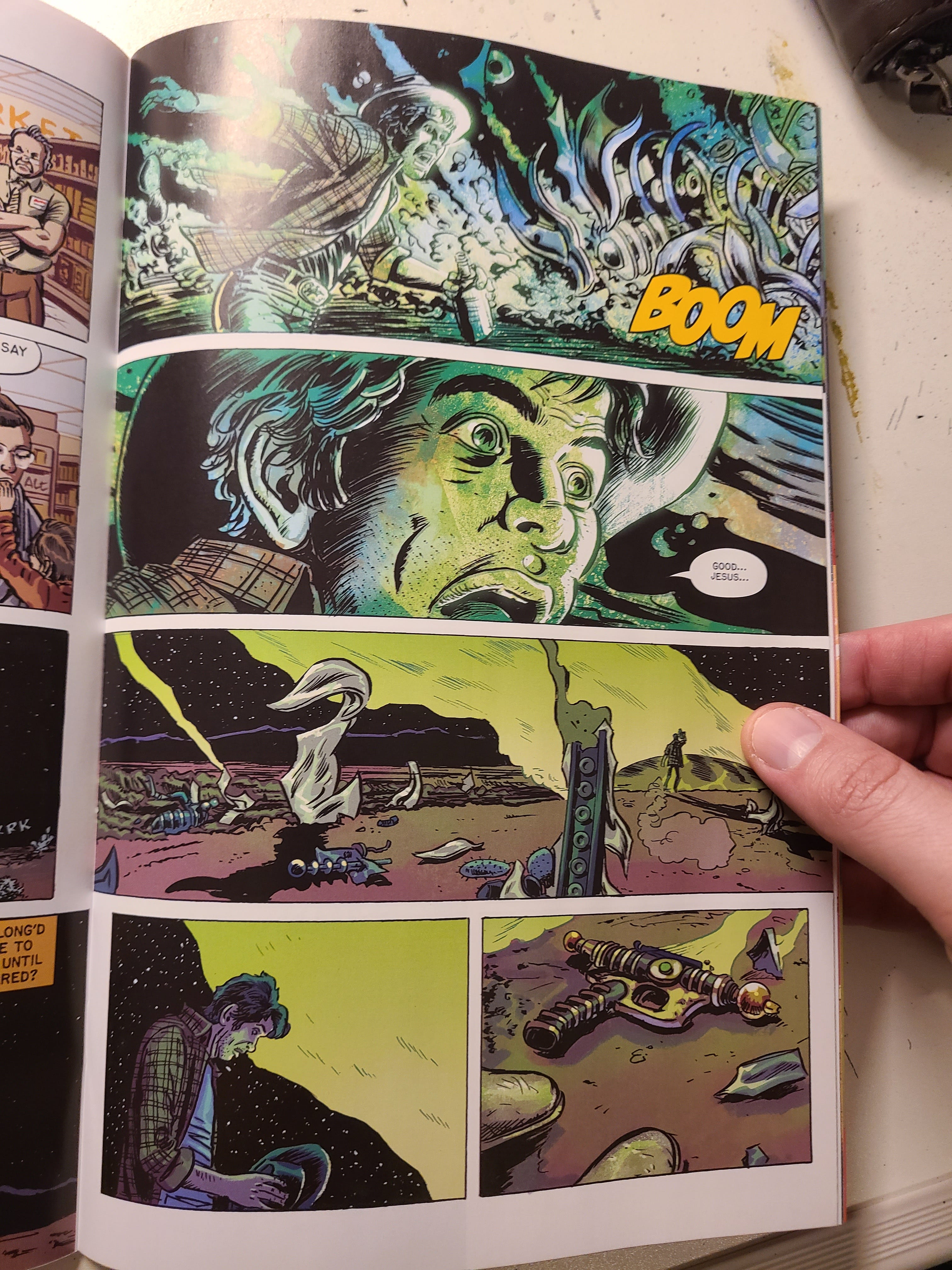
The story was so fun and eerie, and, of course, Lapham’s illustration is just incredible. Read Stray Bullets if you haven’t, I beg of thee.
I love that Oni has brought EC back in this way. It blends old-school and new-school in a way that improves the comic book industry. Maybe someday Oni Press will give me a shot at a short story in one of their books (Megaphone, anyone?!). I have ideas galore…
Speaking of ideas… per the usual, while mid-project, my brain can’t seem to sit still. There just might be something else coming to fruition…
But, enough of that for now. Back to regular scheduled programming! Have a good week!
Thanks for you time,
Nico
The hand lettering is always a win visually! It’s something I’ve always wanted to do because it definitely maintains the intended energy desired by the author. It’s like the process from raw sketches to clean lines—there’s always some loss energy and/or emotion. Also couldn’t agree more that it’s like a conversation!
I also have been enjoying the ONI EC anthologies. Cruel Universe has been better in my opinion, in that it has stuck to and excelled at the tried and true structure of the final page twist.